Building and scaling a design system
Develop a scaleable design system that continuously grows and evolves and provides a single source of truth for
all iSelect design work that reflects our brand guidelines - Tangelo v2.0

The Challenge
Internal:
-
Inconsistent application of brand across products - Teams were interpreting and applying branding differently, resulting in fragmented design outputs across platforms.
-
Inefficient cross-functional collaboration - Handoffs between design and engineering were time consuming due to lack of shared standards and documentation.
External:
-
Inconsistent customer experience across channels - The absence of a unified design language resulted in clunky interactions and unclear navigation, especially for returning users.

The Solution

-
MVP: Component library with Figma.
-
Achieving end-to-end consistency throughout the digital journey requires an up-to-date, common DLS
-
The product will not create quick access code for developments teams (this would be a post-MVP solution)
-
Following Agile development practices, and working with design / Product/ engineering team as cross-functional team collaboration
Role
-
Senior Product Designer ( team of 4)
-
Researcher
-
Component tester
Tools
-
Figma
-
WebAIM contrast checker
-
Confluence
-
Jira
Duration
FY24 Q1-2

Laying the foundations
-
We are researching the best practices for managing Figma technologies, focusing on how to set up foundations effectively and collaborate with the engineering team.
Currently, we use local variables and local styles to manage design foundations. For example:
-
Variables: Include foundational elements like the color palette and grid systems.
-
Styles: Cover aspects such as effects and typefaces

Components


-
The next step involved building an evolving set of components, guided by the principles of Atomic Design. We continuously collaborated with the design team to define the logic for setting up component properties.
-
We conducted accessibility audits using WebAIM to ensure the components met accessibility standards. ( (WCAG.2.1 AA) particularly in areas like color contrast.
-
By aligning with each other, we ensured a collaborative approach that streamlined the process and improved efficiency.
-
We allocate tasks across the design team, with the orange boxes above assigned to Carrie.
Atoms
Molecules
Organisms


Testing / Demo and showcase
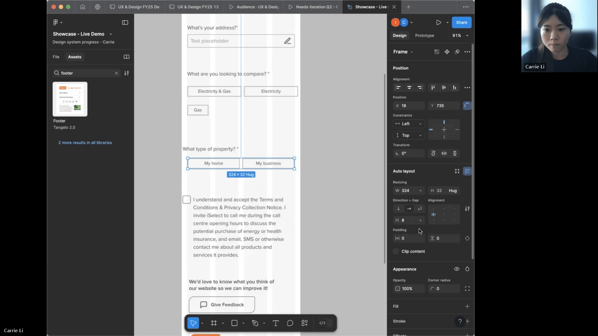
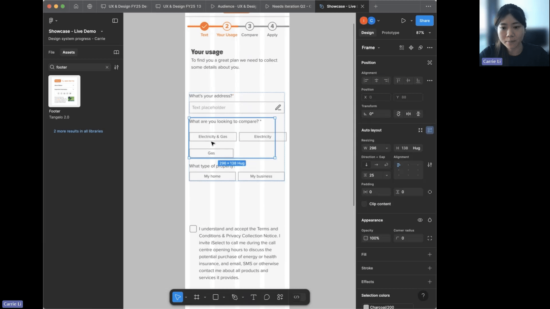
Here is an example of how we effectively apply modules to a page using the design system in Figma, as well as how we adapt the page design across different devices.

Outcomes
Within two quarters of starting the role, we successfully completed the redesign in time for the MVP launch.
The Design System was instrumental in achieving a impactful launch:
Internal Benefits:
-
Enhanced efficiency in aligning existing products with the new brand guidelines.
-
Improved scalability for new products, allowing for faster and more consistent development.
-
Streamlined collaboration through seamless hand-offs between design team and engineering team.
External Customer Impact:
-
Delivered a cohesive and consistent branded customer experience by applying a unified set of design principles across all digital products.