Private Health Insurance Comparison
Improving UX maturity of private health insurance online comparison experience for customers

Stakeholders
PM
BA
QA
Developers
Marketing
Commercial team
Tools
Sketch
Invision
Miro
Confluence
Jira
Duration
12.2022-03.2023
My Role
As a cross functional enabler, I mainly involved in end to end product design process, collaborating with stakeholder ( PM, BA, Delivery team, QA, Data legal team, etc) within Agile environment.
My roles included ( end to end):
-
Researcher
-
Wireframe & Prototyping (solely)
-
UI Designer (solely)
-
Design Tester ( with QA)
Overview
Project Brief:
PHI (Private Health Insurance) comparison is facing strong competitors on the market and look at the current iSelect platform - which is out-of-date UI and lacking some of functions which competitors have. Its worth to conduct in-depth research and uplift UX of the comparison journey.
After we conduct research and customer testing - usability testing & competitor analysis, we found opportunities on Enhanced Results Page ( plan listing) - which is the most important step of the whole comparison journey.
How might we...?📝
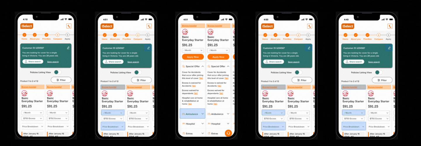
Plan listing page ( including View Details page) is the first priority of the whole comparison journey. How might we improve plan listing design, help customers better understand Health Insurance options which will lead to an improvement in web conversion?
Design process

Research Approach


Usability Testing
-
10 participants conducted the test session via mobile (5) & desktop (5)
-
Individual session (1-1h)
-
Go through current journey & 2 competitors
-
SUS scores: Over 68 (average)
Competitor Analysis
-
examine iSelect’s strength & opportunities of health vertical’s features/functions from user experience perspective, based on 5 key competitors' product, the exploration of what each of the competitors’ strengths and weaknesses will provide insights that can be applied to iSelect’s website development.

Over 200 Insights
Key Findings / Insights


Target Audience


Design solutions
Problem Framing
"I would make a spreadsheet.. To compare..."
Users are able to compare 4 preferred products
Compare shortlist
Designed 2 CTAs for user - Apply Now & View Details
2 CTAs
Move payment frequency filter into each of the product card
Payment frequency
Created icons of key benefits - includes, excludes & restricted
icons for information
Following the current design system and uplift the information architecture (better layout)
UI improvement
Summary of Key Changes
-
Search Summary moved from left hand side to top banner
-
Filters moved from left hand side to Button functionality
-
Hospital category moved along top (colour coded/clickable)
-
Product Name added to display
-
Payment Frequency moved next to price
-
Price information (LHC and discounts/rebates) moved into accordion (default to closed)
-
Special offers/Ambulance/Hospital and Extras into accordion (default to closed)
-
Compare policies feature (secondary release)
-
Use of icons to depict if something is covered/excl/restricted (within Hospital/Extras section)
-
Static Key above footer explaining icons
Wireframe

Prototype & Design


Test
To make sure the new design meet customers behaviour and expectation, we conduct customer testings - user interview and preference testing with the mobile prototype.

User Interview
Tested the mobile prototype with 5 participants, 45mins-1h / each), testing task including: new details & compare shortlist & expand information…
Preference Testing
Designed to compare the current Results page & View details page and the new version consisted of UI elements. (Sharing two-three design variants with participants and asking about their preference – which one they like and why.) We obtained 20 responses.