Material Typography Exploration with Chinese Characters

My Role
Researcher, photographer,
Creative director, Poster design.
Results
This is a personal practice on typographic experiments
with materials.
As a communication designer, exploring typography with different materials is a way to grab the viewer’s attention, build a hierarchy, tone, and value of a brand in modern design. Experimental typographic design is more emotional, deeply human than cold typography, when viewers focus on water, ink, and charcoal font, they have deeper understanding on the exhibition, and brand recognition had improved.


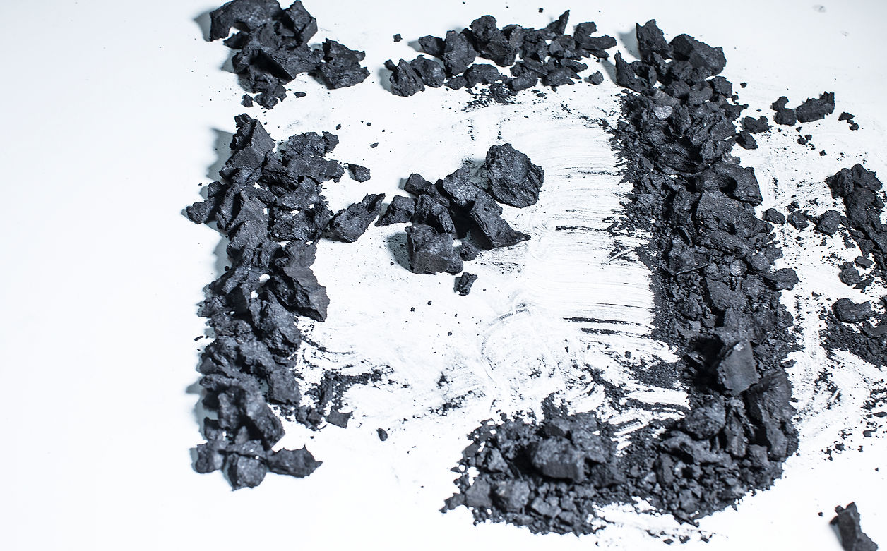
Materials: Ink, Water & Charcoal
I used three materials: ink, water, and charcoal which present human origin to practice with Chinese characters. Finally, among thousands of Chinese characters, I focus on two characters: “问”“道” which express "questions" on "human beings'" origin and constraints on human behaviors. Besides, “问道” is also the theme of the exhibition which was held in Beijing, Shanghai, Guangzhou, China. The exhibition presents Chinese traditional ink and brushes painting.


“ The typography much more ambiguous and open for interpretation. I found that by utilizing an open typographic approach combined with the clear message many viewers have an easier time relating their own experience.”— Stefan Sagmeister
